Home
Digital Assets Exchange For Institutionals

Digital assets exchange for institutionals
Symbridge was part of an VC-backed ($150M) FinTech startup, a hybrid digital asset exchange with Bloomberg-inspired OTC desk, and unique market positioning with high-frequency
trading support
setup
Role: principal IC designer
Duration: June–December 2019
Company: Newity (VC-backed FinTech)
Product: Symbridge, hybrid digital assets exchange
Scope: user research, product discovery, prototyping, design system, layouts, brand governance
Jurisdiction: United States
Context
The core challenge
How do you design a product from zero to one that:
- Meets regulatory and compliance requirements
- Supports multi-party financial processes
- Scales across jurisdictions without impairing the user experience
- Maintains clarity, confidence, and precision in high-risk interactions
The challenge was making complexity legible and operationally safe.
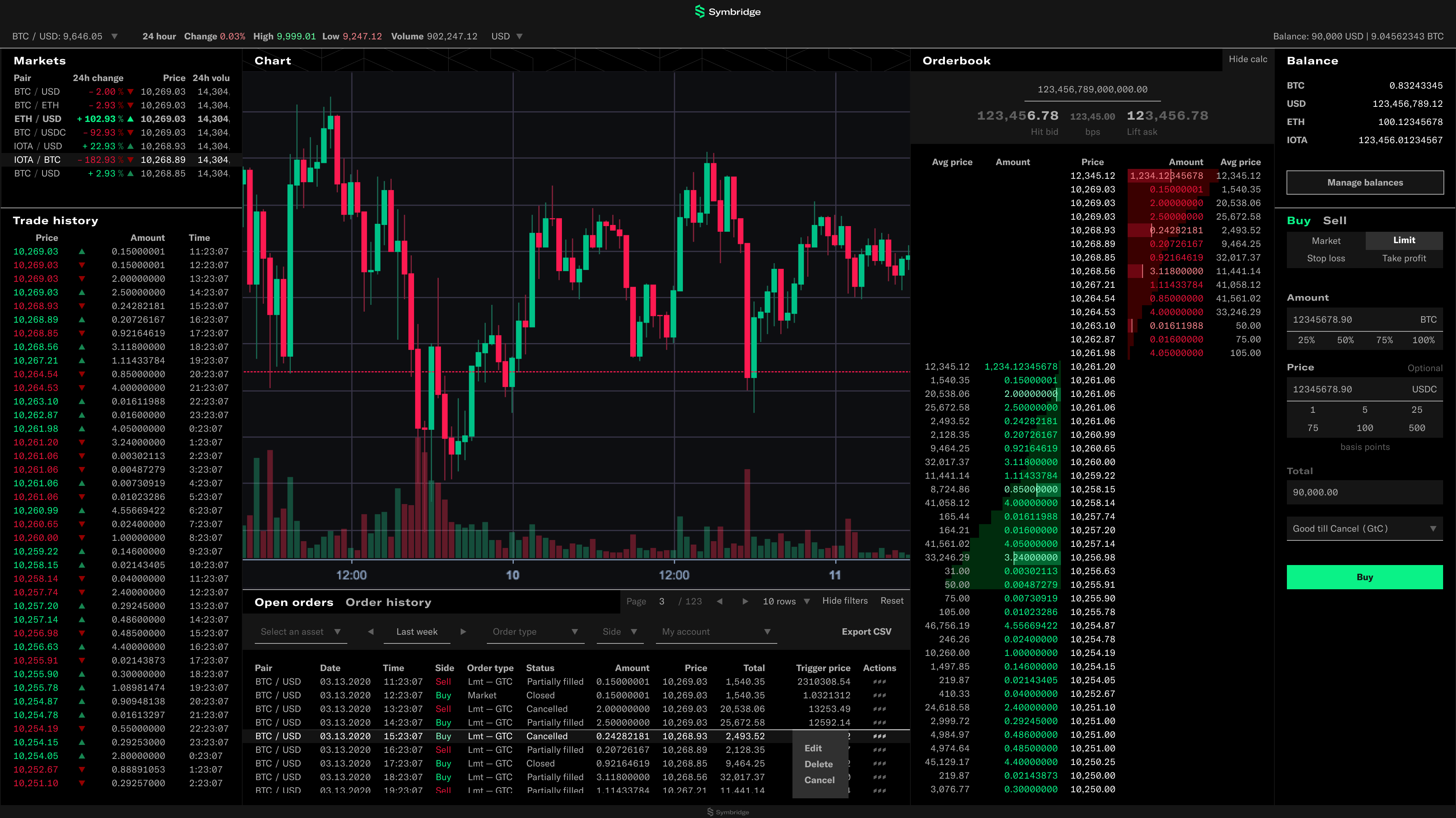

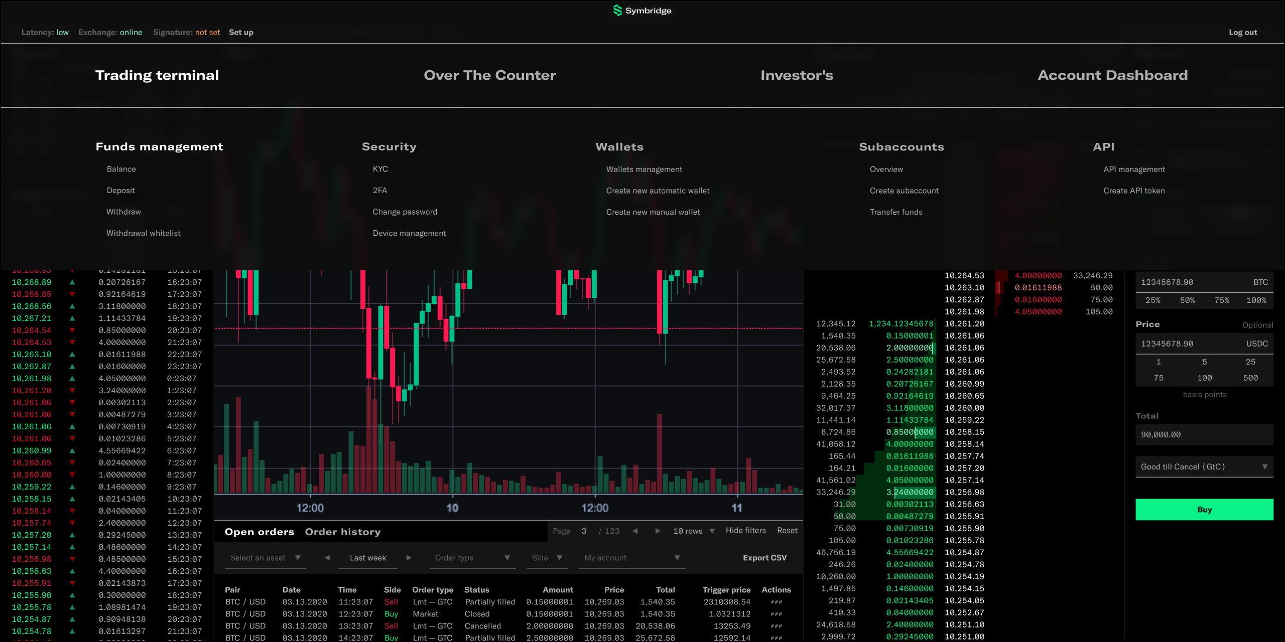
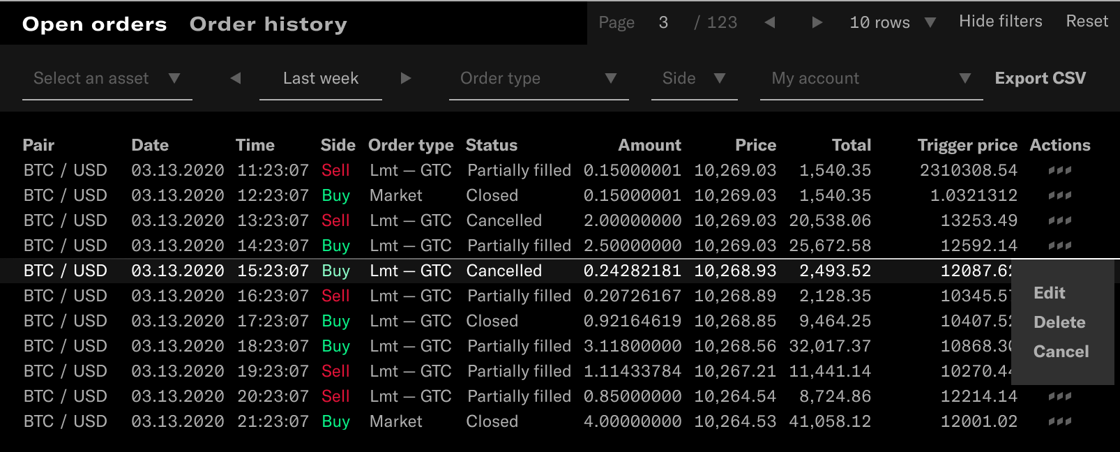
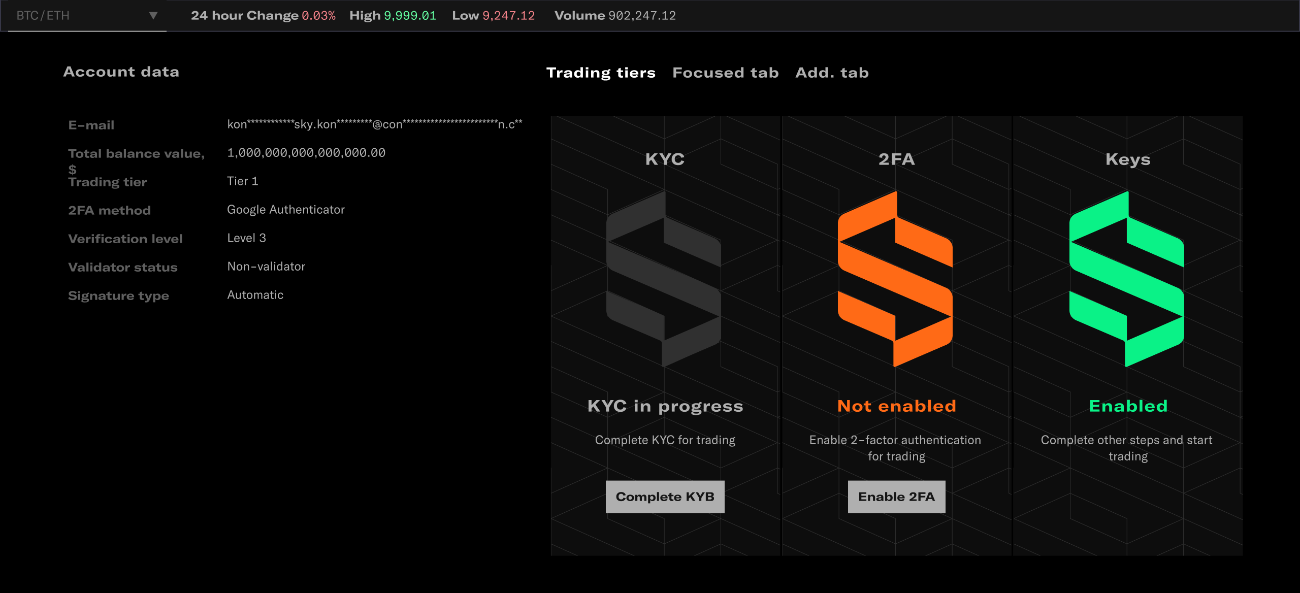
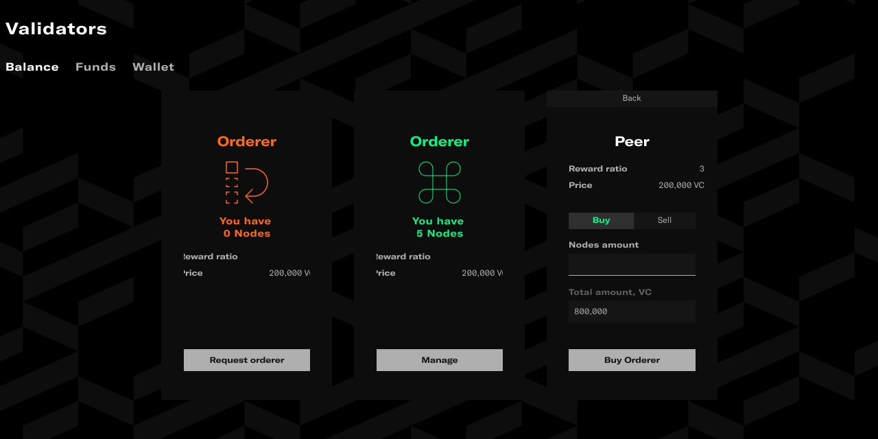
Trading terminal

Design
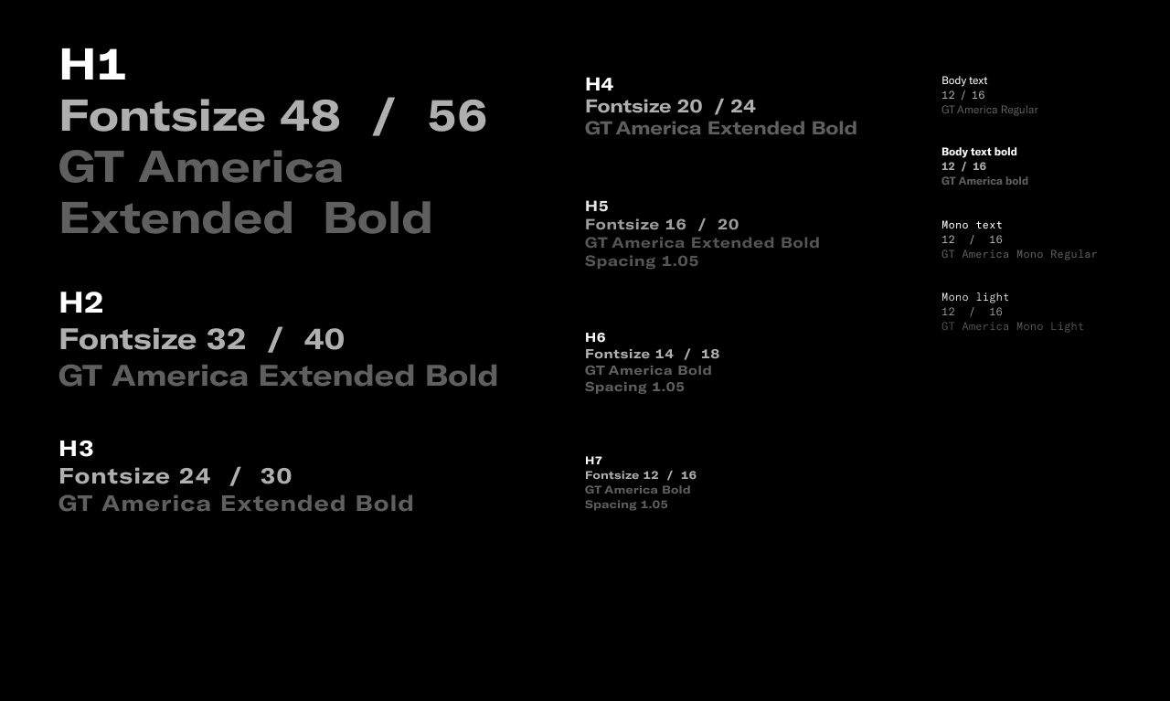
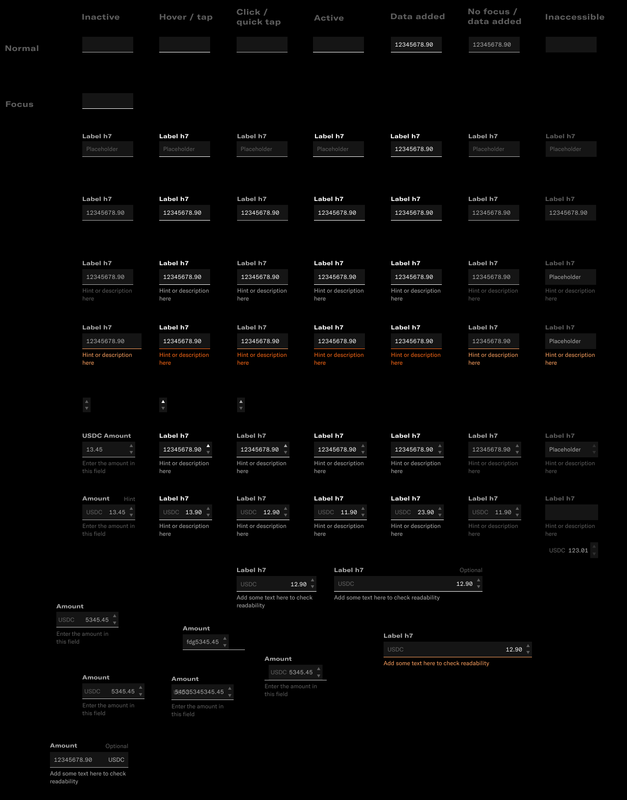
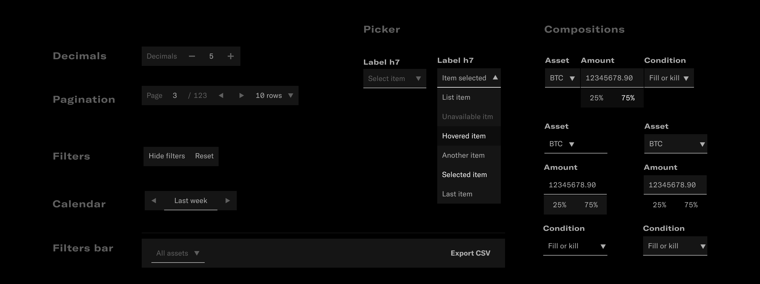
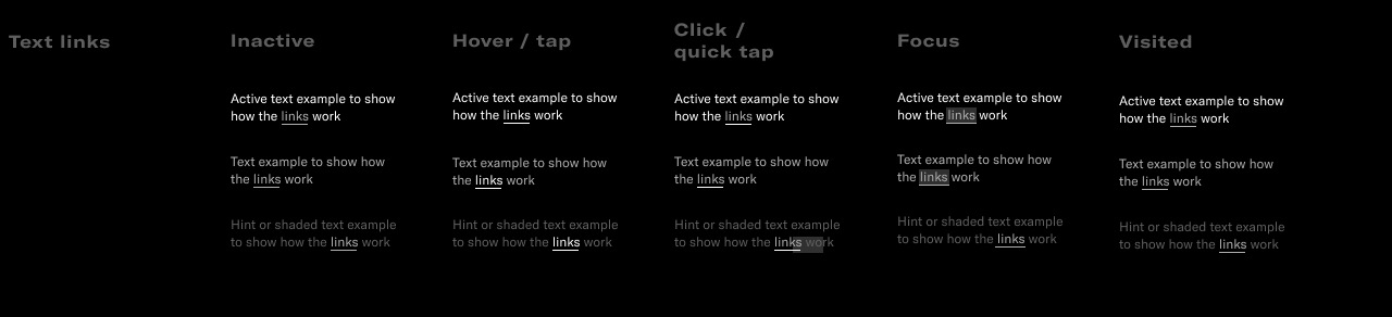
Design System
Built with atomic approach and based on the brandbook it provides bold and premium feel to the product.
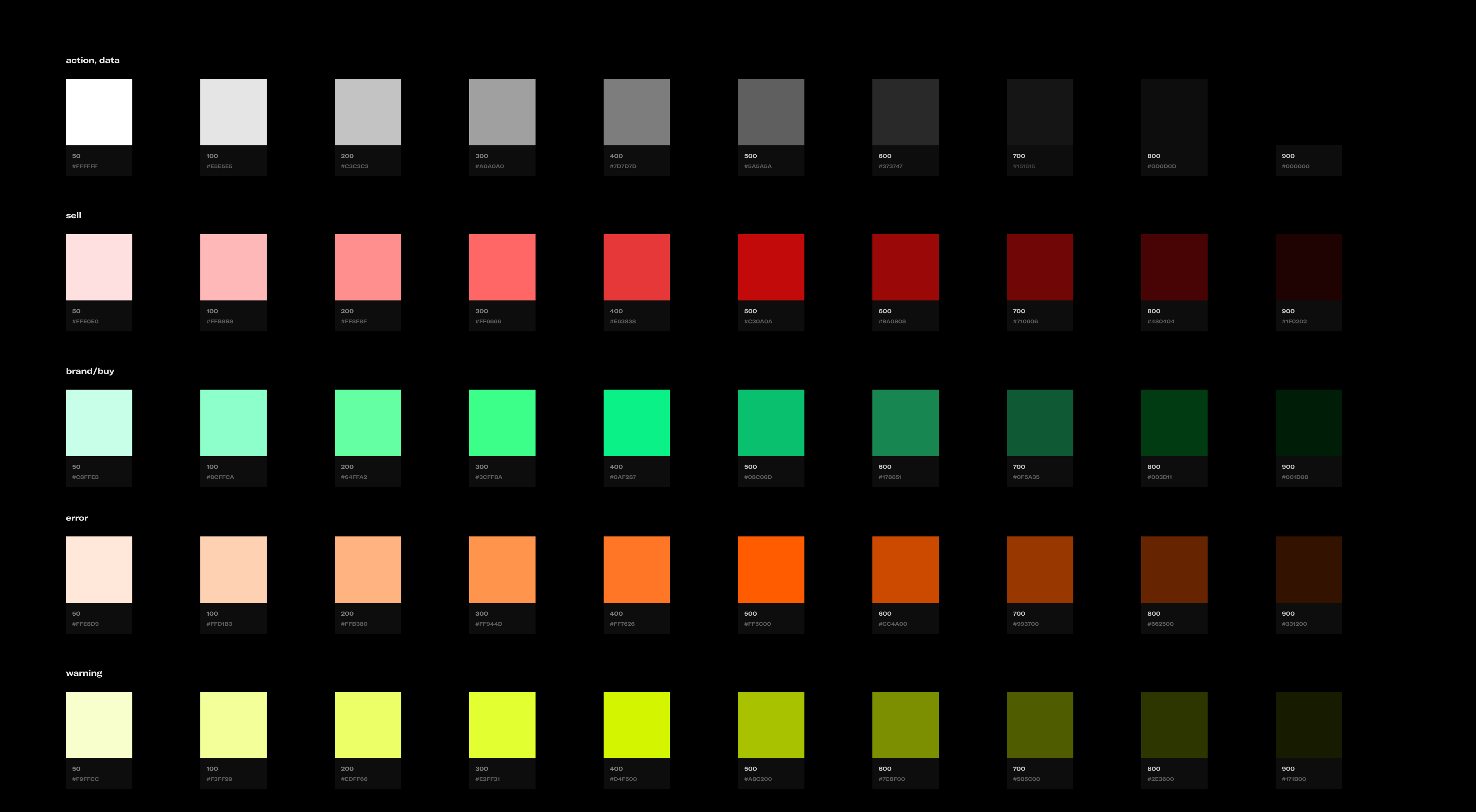
Color System
The color system reflects the idea of proximity. The most important items are "the closest” to the user and thus are brighter.
White is the major action color in order not to distract from the primary trading actions set in traditional red/green colors, and to keep colors minimal.
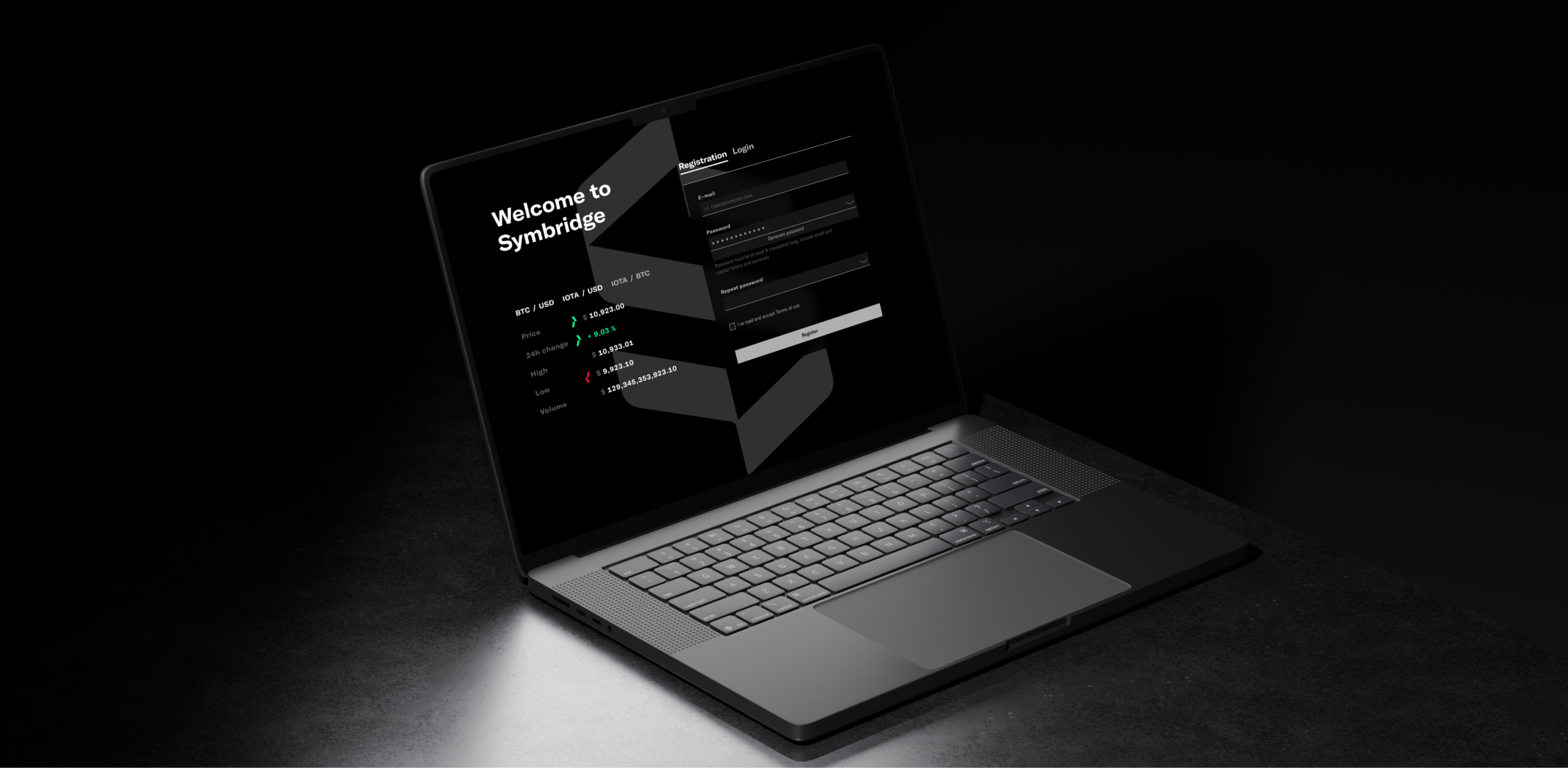
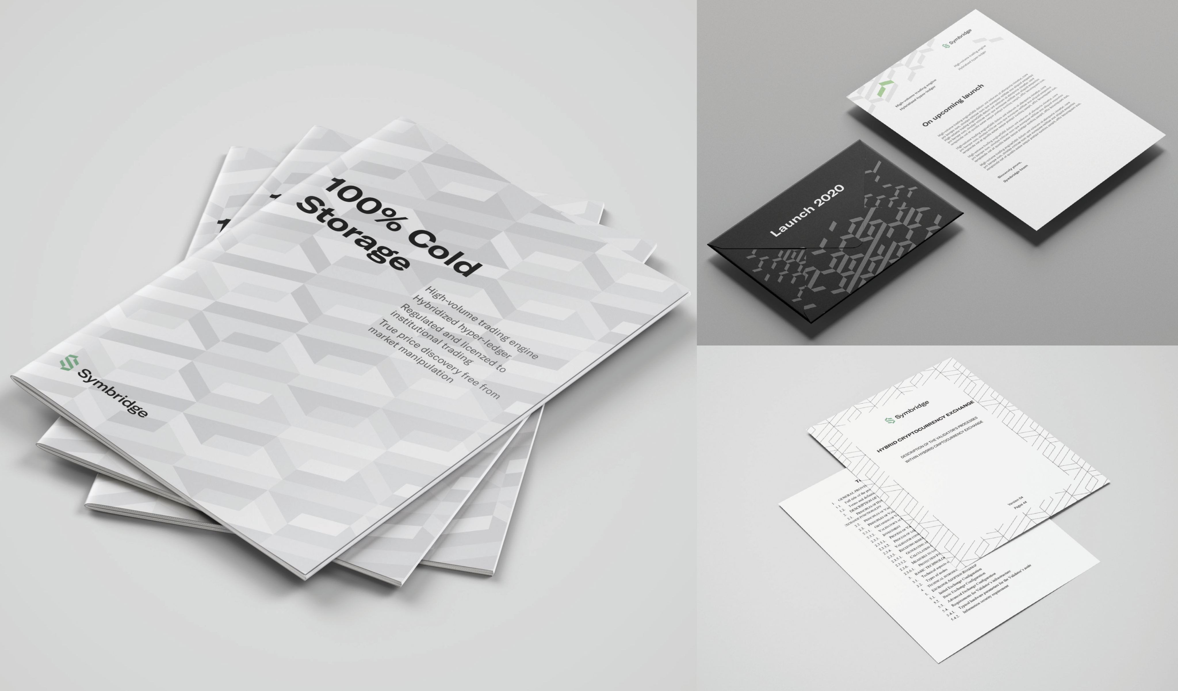
Branding
Product doesn't start nor end in user interface, and I've created brand communication to cover all the needs, from marketing to corporate communication.


Results & Impact
Fully operational business unit
- 100% design coverage for complex product meeting the institutional requirements
- 900M Euro worth of tokenized assets in 2022 were possible thanks to the OTC product section which became foundational.
Key takeaways
I've learned to orchestrate full cycle end-to-end product design while delivering high quality system.
Improved my collaboration and stakeholder management skills while onboarding on a project with tight deadlines and multiple stakeholders across distributed teams.


linkedin.com/in/andy-ad

and.derbenev@gmail.com
Home
Case Study:
Digital Assets Exchange For Institutionals
Digital assets exchange for institutionals
Symbridge was part of an VC-backed ($150M) FinTech startup, a hybrid digital asset exchange with Bloomberg-inspired OTC desk, and unique market positioning with high-frequency
trading support
setup
Role: principal IC designer
Duration: June–December 2019
Company: Newity (VC-backed FinTech)
Product: Symbridge, hybrid digital assets exchange
Scope: user research, product discovery, prototyping, design system, layouts, brand governance
Jurisdiction: United States
Context
The core challenge
How do you design a product from zero to one that:
- Meets regulatory and compliance requirements
- Supports multi-party financial processes
- Scales across jurisdictions without impairing the user experience
- Maintains clarity, confidence, and precision in high-risk interactions
The challenge was making complexity legible and operationally safe.
Trading terminal
Design
Design System
Built with atomic approach and based on the brandbook it provides bold and premium feel to the product.
Color System
The color system reflects the idea of proximity. The most important items are "the closest” to the user and thus are brighter.
White is the major action color in order not to distract from the primary trading actions set in traditional red/green colors, and to keep colors minimal.
Branding
Product doesn't start nor end in user interface, and I've created brand communication to cover all the needs, from marketing to corporate communication.
Results & Impact
Fully operational business unit
- 100% design coverage for complex product meeting the institutional requirements
- 900M Euro worth of tokenized assets in 2022 were possible thanks to the OTC product section which became foundational.
Key takeaways
I've learned to orchestrate full cycle end-to-end product design while delivering high quality system.
Improved my collaboration and stakeholder management skills while onboarding on a project with tight deadlines and multiple stakeholders across distributed teams.
linkedin.com/in/andy-ad
and.derbenev@gmail.com